Pages

Monday, November 05, 2007

Zig Zag

Sometimes we get models who don't want to be involved in creating interesting poses, so they just stand there. One of the things I always try to express when this happens is, remember to zig zag your line. What I mean by that is when drawing a model that's too stiff we need to push and pull the pen left to right, find what's interesting in the pose. Feel their balance in the hips, the shoulders or the tilt of the head and neck. Many times our drawing arm moves mainly up and down {in the strokes} causing the structure of the sketch to be too stiff. Moving left to right can help add some rhythm and zig zag!


Thursday, September 20, 2007

A pen worth mentioning

This is actually a very bad photo but it's all I got for now. I did the drawings below with this pen called "Copic sketch". it's japanese and very cool. It has the brush tip on one side and a chissel tip on the other.

Jenny Lerew of "Blackwingsketch.blogspot.com" introduced it to me.

Monday, September 17, 2007

Wednesday, September 05, 2007

Spontaneous Human Combustion

This was one of the first articles I ever wrote on gesture drawing. It was posted on Jim Hull's site "sewardstreet.com". Jim was generous enough to go through the trouble and upload it back then. I thought it would be alright to re-post it here on my own site.

I hope alls well.


Imagine fire from within burning your body and all that’s left is a charred outline of what you used to be. Some doctors say it’s not possible and many conspiracy theorists have websites full of pictures and stories about it, who knows maybe it is possible to physically burn up. But when you put this into the context of creativity and passion it’s very possible. Inspiration sparks inside of each and every one of us all the time, whether it’s by another artist’s work, music, or a lover. Either way it’s always there, and more often then not you notice it.
If these sparks of inspiration are ignited spontaneous combustion will occur. It will send you ablaze on the hot trail of making new art and new ideas that you never thought you could do. Thus leaving behind a charred outline of the old artist you used to be.

Let me explain a bit, One of the things I learned from the late, great, Walt Stanchfield was an artistic equation he would always quote during the classes he held at the Walt Disney feature animation studios.

Impression - Expression = Depression

Now I don’t think Walt wanted everyone to think that they were depressed and psychologically challenged. I believe he was talking about being inspired and doing something about it when you are. I figured it this way.

Inspiration from where ever – Execution of art from that inspiration = letting the spark pass you by and not growing as an artist

One of the things that I will always encourage is keeping a sketchbook. Whether you’re an oil painter, story artist, animator, or sculptor, the benefits of watching people and capturing that moment on paper is priceless. A sketchbook to an artist is like batting practice to a home run hitter in the major leagues. Even established artist can grow stale, one of the great ideals of sketching constantly is that it keeps the old gears oiled up. The other important reason is, it adds to the well of resources in your head.

This well in our heads is very important and it feeds off of the inspiration needed to fill it. I always keep a sketchbook, it allows me to reference my well of resources in my head of what things look like or how someone acts when they’re mad or confused or any emotion I may have drawn. Animation artist {particularly story artists, because they still draw by hand} should be sketching all the time in order to keep a knowledge of life they can pull from when they’re doing their work.

The sparks are always there and we need to capitalize on them. The way a man hugs his wife, the way a child plays or even someone reading a newspaper at a coffee shop. As you see these things, a strange burning begins to occur inside of you and lines frantically form on a page and blam! You’re on fire. Before you know it you have pages of art that never existed before and your becoming a better artist for it.

Days have come when I didn’t have my sketchbook and all I can do was kick myself. The best recovery I can think of was reaching for a loose receipt or a napkin and sketch down a quick drawing on it, and take that home with me. The problem with that was, a whole bunch of loose pieces of paper around that I couldn’t keep track of

On the left is a drawing I did in 1994. A niece of mine, who has since grown up, ran passed me and I drew this as quickly as I could. On the right is my quick sketch of what it could’ve been if I were to draw it today. As you can see they are very different and seem to have been done by two very different artists. If you’ve read any of Walt’s “Words of Wisdom” handouts he would take artist’s sketches and give little critiques of them. These critiques and examples were valuable and great to learn from. This is the sort of thing that will continue to do.


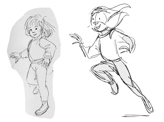
The first drawing seems to lack some life and energy the arms seem to be a little stuck into the body, at least her right arm for sure. The legs seem to be a little stiff and there’s hardly any action to the pose. In the second drawing it feels like she’s going to go into another pose. All the lines are drawn in rhythm to get the whole body working together for the action of running. Life seems to be happening in the second drawing as opposed to life frozen in the first. I will get into it a bit deeper as we go along in the coming lessons, but for now enjoy my embarrassing drawing from 1994.

Anyhow, the most important thing I’d like to stress in this writing is, be ready to fuel the spark inside of you, and spontaneously combust into a new artist and leave the charred old artist behind! The sparks will come and if you let them pass, you might want to kick yourself when you wonder, “Why am I not getting any better?”

Wednesday, July 18, 2007

Get Creative

Sometimes in the drawing class we are beat over the head with the thought that we have to be photorealistic which may cause us to get a bit stiff. I now there's a place and time for the more classical way of drawing and painting but we in animation like to be a bit more impressionistic right?

So the other day we had a model {very graceful}who would continually do the same pose for us, over and over and it made me think "I have to get creative" and caricature her and still try to get the gesture out. You start to push the shapes more and accentuate the forms into an impressionistic style and not a realistic style even though its all based on reality.

The impressionists work of the past always seemed to have an energy to it and even a sense of movement. I truly believe we're all impressionists in animation, and if they we're alive today they would be into our art form.

Any how have a good one.


Wednesday, June 27, 2007

Overlap the neck

There's a common problem that occurs when we sketch too quickly or we're just not paying attention. The neck/chest connection just doesn't quite cut the mustard. It happens to me often in the early stages of the gesture and I usually try to catch it and fix it.

The circumference of the neck starts at the clavicle and connects to the back spine of our bodies( obviously we all know that). But many times when we caricature we draw the neck lines right on top of the shoulder line. It runs the risk of having tangents in the drawing and thus flattening out the pose. That neck needs some sense of overlapping shapes to help make it feel connected to the body in a natural way.

I sketched out the examples for this with one of my students and the T-shirt analogy came up. If you look at your shirt you'll see that the hole for your head comes out of the front, not the top where the shoulder seam is. Also, clothing has all the gesture lines we need to help guide us in the line work. Use the collar, use the seams, use whatever it is on that clothing to reveal the form. It's all overlap, and it is needed, unless you really want a flat looking drawing. Even those who draw in a so-called "flat" design style make use of these principles. Shane and Shannon, for instance, use overlap beautifully to show the forms working together, as well as staying completely away from tangents! They're super good!

Down below I threw in a couple of drawings I liked, just for fun.

Hope all's well......


Friday, April 27, 2007

This girl is fun to draw

Heather Hoxey is one fun person. She came to my CALARTS class to model for us a couple of weeks ago. She was a hit so I had to get her into my regular class at DW. Either way she really is spunky and fun. I had a blast drawing her.


Monday, April 02, 2007

Marissa Gomez strikes again!

Marissa is one of my favorite models. I only wish I had more time to draw her.


Tuesday, March 13, 2007

Thoughts on drawing for storyboards-PT 4

Make those pupils read!

I've been seeing a lot of portfolios in the past few weeks and one of the things that really stands out to me is the lack of prominent pupils in story boards.

Strong, definite and clear eye direction is extremely important when it comes to boards. It allow us to see the thinking behind the character. All too often I see boards with huge eye circumference and tiny pupils, and it's really hard to see into that character's thoughts. I understand that there are different character designs out there but, story boards should be "read from across the room" even in this digital age. We look at the eyes first- and that allows us to see into that characters soul, his/her internal struggle. If I can impart anything to anyone who is putting together a portfolio or working on story boards at all...

Darken those pupils! Make them read!

Thursday, February 22, 2007

Tuesday, January 23, 2007

Three of Many

I say three of many because there are a lot of duds that don't make the cut. If anyone out there is building a portfolio the best way to do it is to work hard and Draw! Draw! Draw!

This is the motto of my class!

Rather than drawing specifically for a portfolio and have no discerning choices at hand. One should draw becuase they love it and pick the best drawings from that stack.

Give yourself choices.


Friday, January 12, 2007

Thoughts on drawing for storyboards-PT 3

"Negative space and overlapping shapes"

In all my days as an animator, story guy, and just plain sketch artist I've always had trouble with trying to get a pose right and make it "read from across the room".
I kept trying and trying and one day back in the Disney days, my good friend Tom Gately{Now an animator at a certain studio in emeryville- shamelss "freindship dues" plug} told me the most obvious of reasons why my drawings weren't reading.

"Your sillouette value is off"

Darn it! He was right and I couldn't get it out of my head. Now I know that's animation 101 but the easiest thing to understand isn't always the easiest thing to execute. For example I understand that an Archer needs to hit the bullseye from a far distance but I probably can't hit that bullseye for beans unless I work at it for some time and keep trying.

So ever since then I've been haunted by Tom's words in my head. Every drawing I've worked on to this day feels like it has his eyes of concern watching over saying "Your sillouette value is off".

All this time I tried to understand and break it down to the simplest form and the two principles out of the many that stuck out, where Negative space and Overlapping shapes.

When these two ideas are grasped and put into action your sillouette values will start to pop off the page. If your sketch or production drawing isn't working you might want to check and see if the drawing is breathing; is there enough air around and within the pose to see every part of it's acting or reason for being?

When overlapping shapes are concerned I always tell the students in my class to use the items on the model to show shapes in front of other shapes. Use the waist line to show the forms and directions of the body, the neck line and collars and even existing wrinkles in th clothing to help show that the knee is in front of the thigh. Props like wrist watches or helmets or anything the person is holding can also help when it comes to overlap.

Anyhow I think you get the picture. I still have to think about it when I draw and I'm glad Tom told me the truth when he did. I just wish his voice would get out of my head.

To help illustrate the point I drew over this wonderful page of Mickey's drawn by the master of sillouette Fred Moore. What's amazing about it was how clear and precise every drawing is and yet very very loose. I found this page on the great Disney History blog by Didier Ghez.

Enjoy.


Tuesday, January 09, 2007

It's all chill!

For what it matters, I'll be puttin' some stuff up soon!

Peace and Happy New Year People!