So once again, now that I don't have any blogger issues I wanted to dish out part 2 of my tips on drawing for story. These pages were given to the Cal Arts kids a while back and I hope that this can inspire others as well.
the principles that weren't highlighted with visual aid in the last post were;
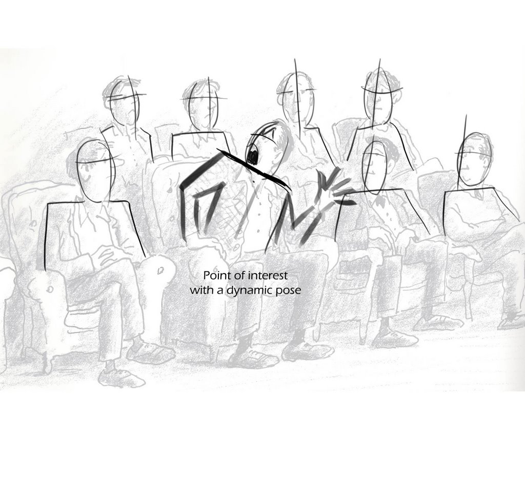
Line Density
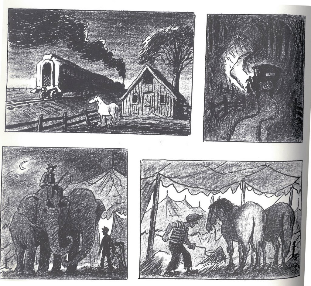
Perspective and overlap
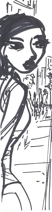
and Leaning the pose
I'm not going to go into heavy detail on these subjects, so I hope these pages are treated more like cheat sheets to remind us of the principles.
The "letter" panels on the left, really helped me understand this idea.

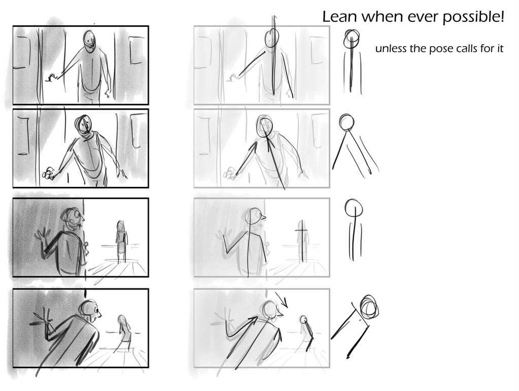
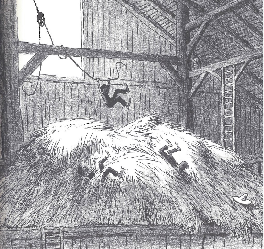
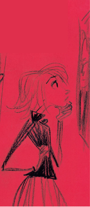
Leaning in the pose was something that Walt Stanchfield always knocked into my head. Certainly the straight poses in my examples have a place in this world but an ever so slight lean or a large lean, in any drawing helps give movement and wieght. Bill Peet does this constantly.

Once again, the perspective panels I drew were really more of a cheat sheet idea to remind us to overlap within perspective. Otherwise the drawings can be flat such as in the example third panel down on the right.
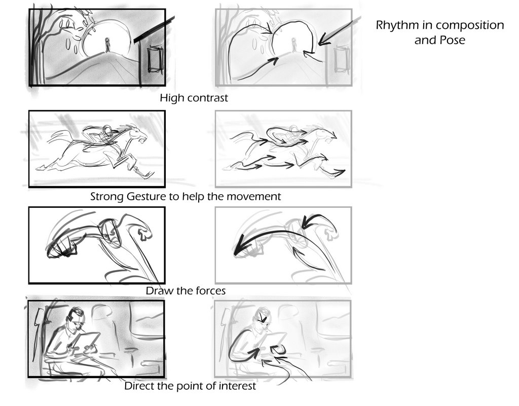
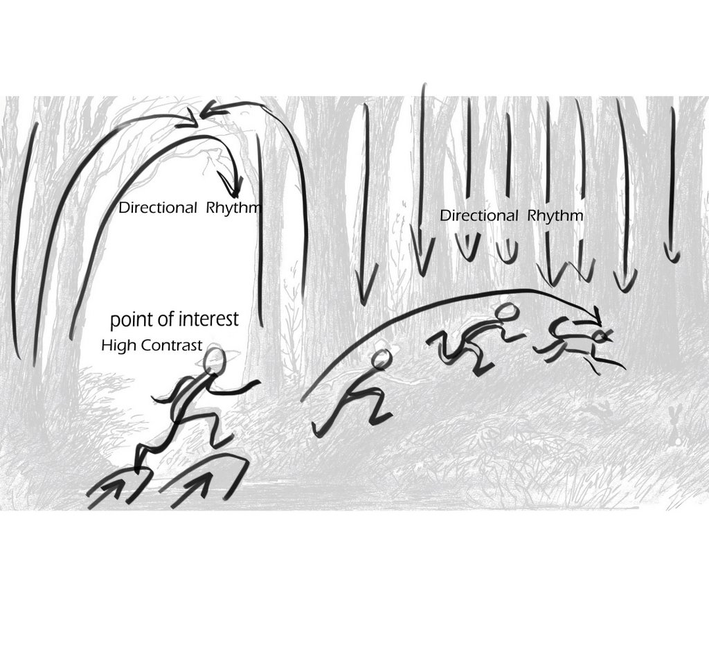
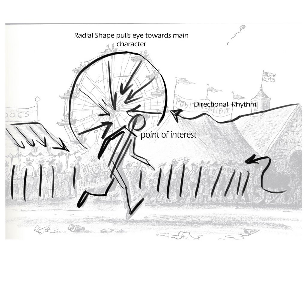
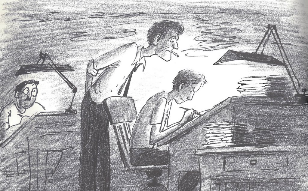
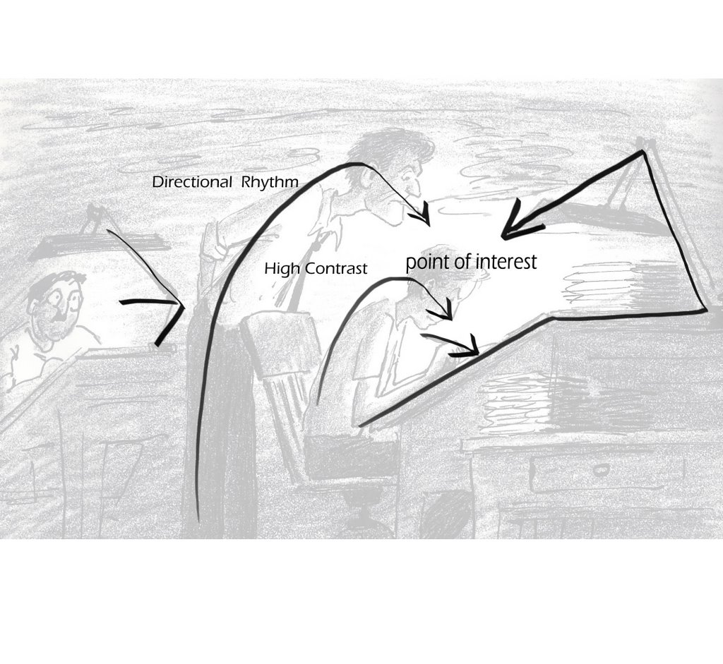
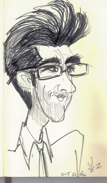
And last a few quick examples of high constrast and rhythm


the principles that weren't highlighted with visual aid in the last post were;
Line Density
Perspective and overlap
and Leaning the pose
I'm not going to go into heavy detail on these subjects, so I hope these pages are treated more like cheat sheets to remind us of the principles.
The "letter" panels on the left, really helped me understand this idea.

Leaning in the pose was something that Walt Stanchfield always knocked into my head. Certainly the straight poses in my examples have a place in this world but an ever so slight lean or a large lean, in any drawing helps give movement and wieght. Bill Peet does this constantly.
Once again, the perspective panels I drew were really more of a cheat sheet idea to remind us to overlap within perspective. Otherwise the drawings can be flat such as in the example third panel down on the right.
And last a few quick examples of high constrast and rhythm


