The terms that came to mind for me where:
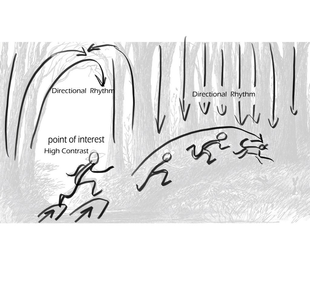
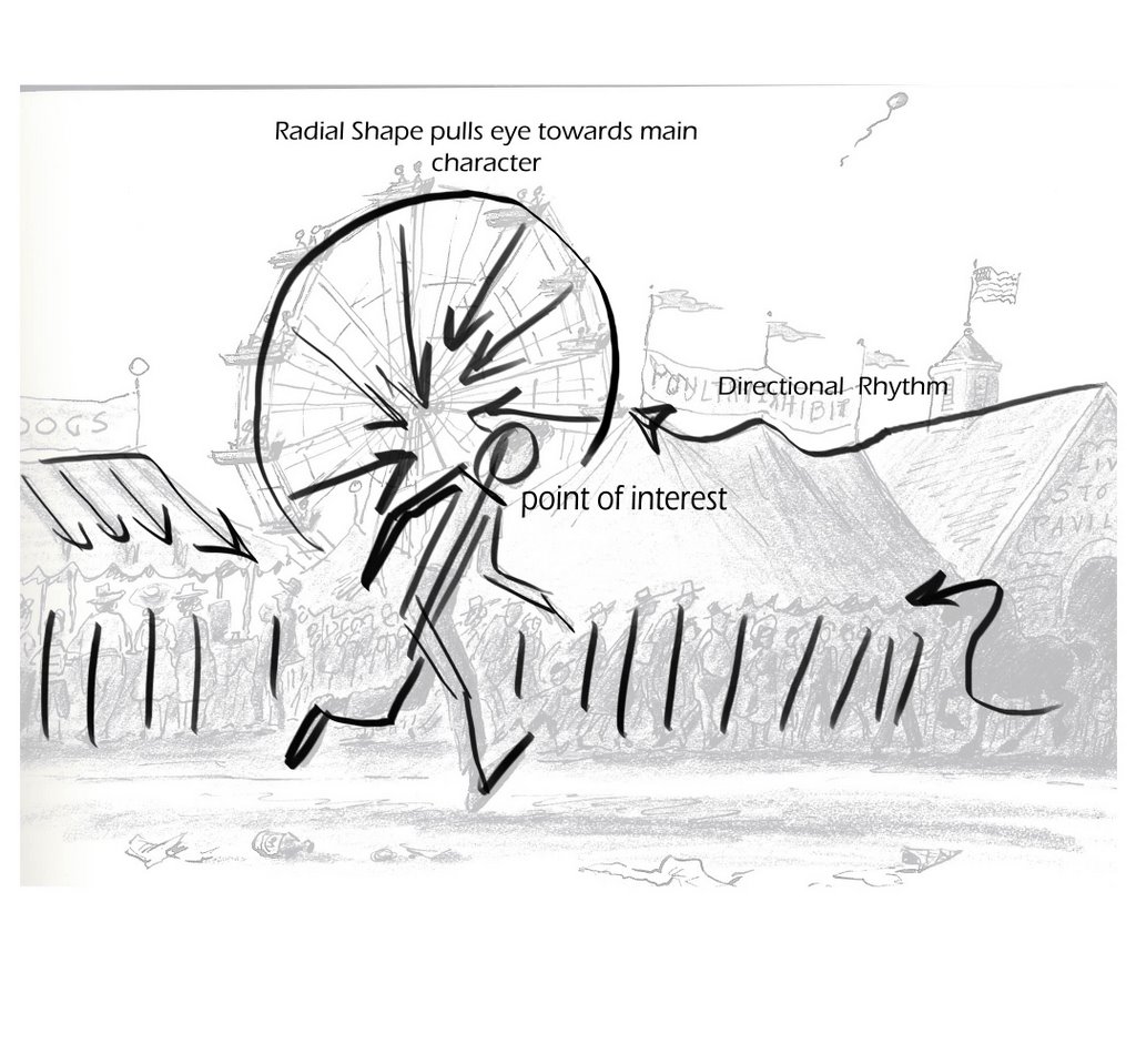
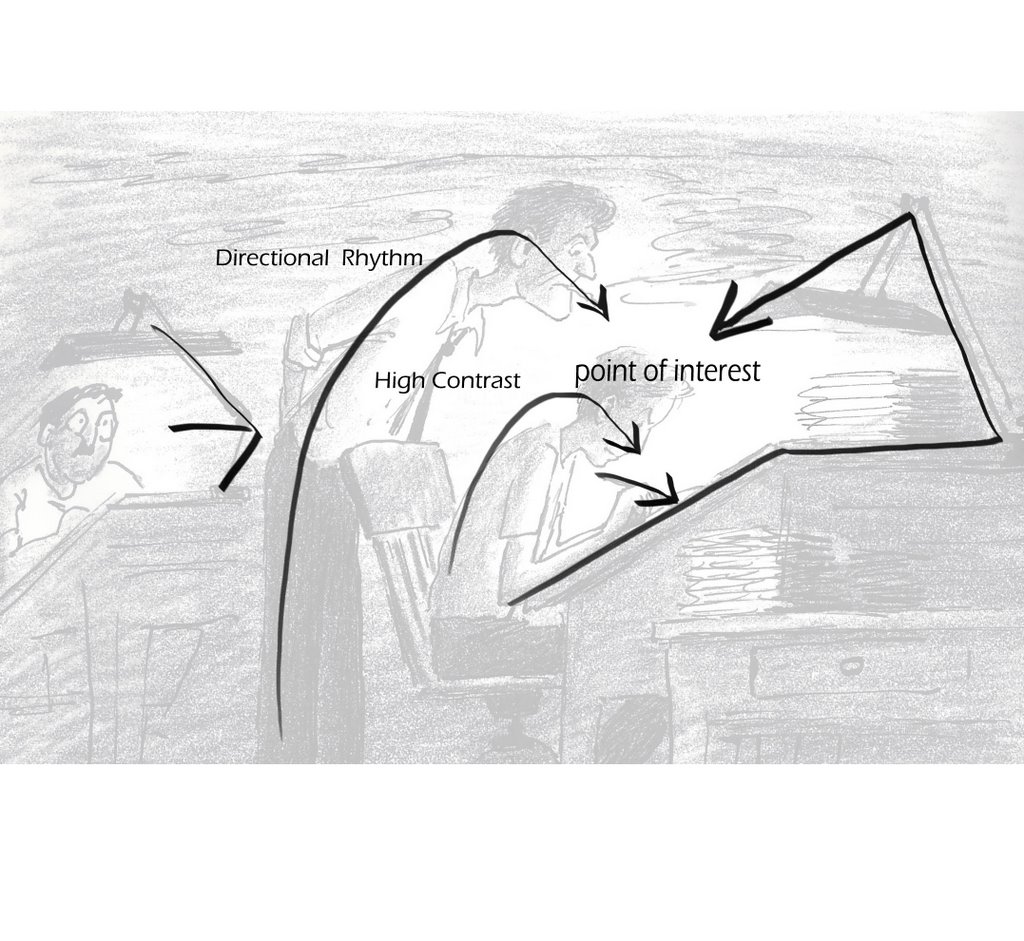
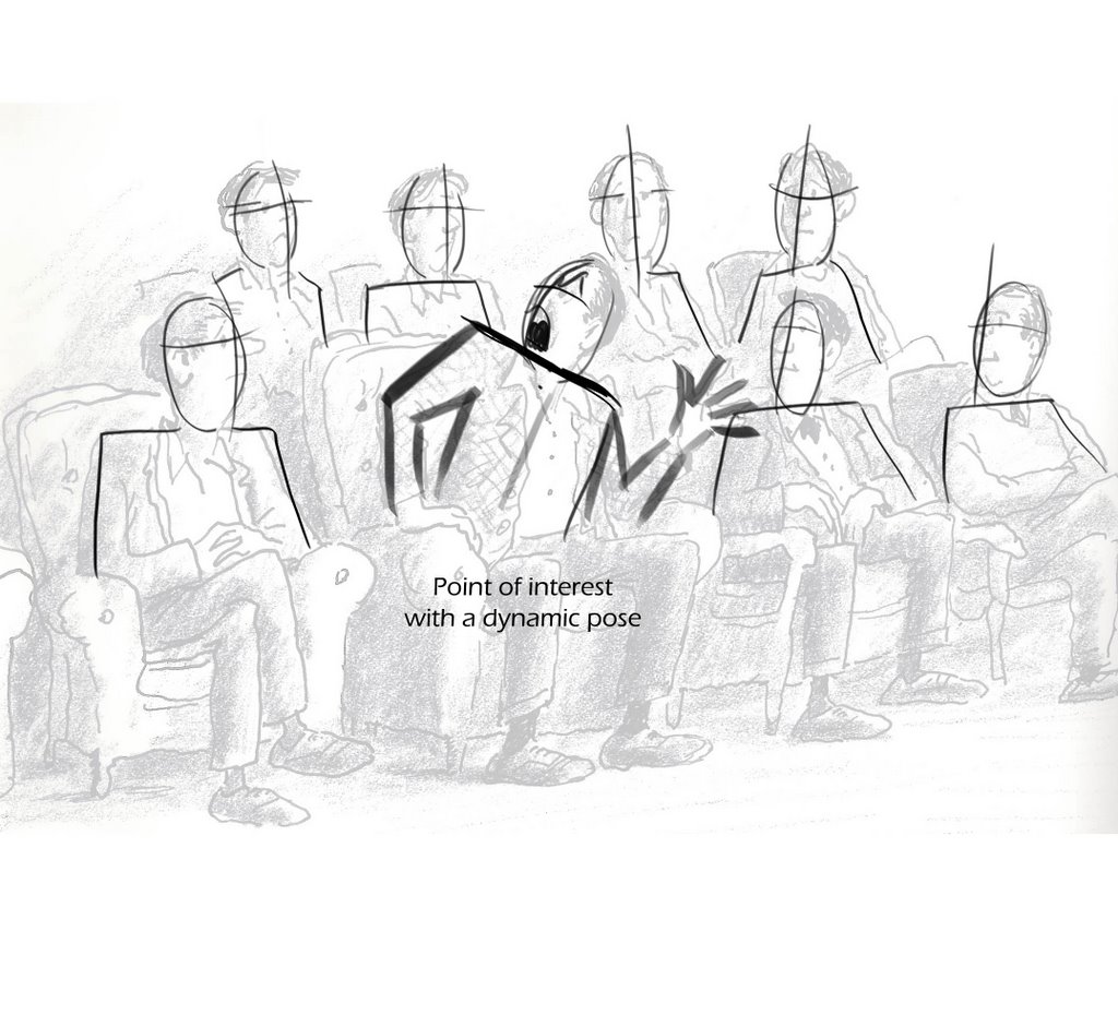
Directional Rhythm- Using the lines and composition of the drawing to direct the eye to the point of interest.
High contrast- the point of highest contrast usually helps define the point of interest or the character you want the viewer to see.
Other terms {that will be on the next post, blogger issues} that I didn't write on these overlays, but it is evident in them, where;
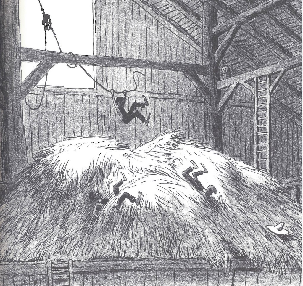
Lean- do it when ever possible, even in the slightest way. only draw striaght up and down if the character calls for it. the more straight up and down the drawings, the less life it could have, so if your character is scared stiff maybe straight up and down is what you need. But lean when ever possible.
Perspective and overlap- We've all studied perspective and any book out there on the subject is usually fairly good to explain it but Overlap it extremely important to execute perspective Be it a flower pot, a car, a person or a building you need visual cues of diminishing sizes and shapes relating to each other to really get the effect working.
line density- the best way to understand this one is, if the object is further away, the lines should be thinner. If the object is close the lines should be thicker.
Tone and Value- Again, simply put, the closer to screen the darker it gets.
Life drawing and gesture drawing do translate to story sketching if we know how to bridge the gap. Hopefully these pics will help.


Great stuff, Dave! Thanks for posting! Can't wait to see more!
ReplyDeleteYes--part 2!
ReplyDeleteI dig it! I loved this book when I picked it up a few years back! I'll have to get it back off the shelf.
ReplyDeleteI can remember my drawing instructors trying to pound all of these ideas into my head yet it has taken years for most of them to really seep in.
One of the things I find most ironic is that the skills required to make drawings as awesome as these are often the skills that most people refuse to learn. Things like perspective, planation, contrast, etc. are often the lessons that most kids walk out on.
Gran análisis mi amigo. Si usted no tiene cuidado su blog pudo rivalizar "El Templo de Los Siete Camellos!!" Gracias por compartir el AMOR. ¡Chocolate Sexual!
ReplyDeletethanks Mark,
ReplyDeleteYou are the king of inspiring posts and boy do you just keep em' coming!
Jenny,
it's coming
ts,
this work is so deceptively simple, isn't it?
skribbl,
dale gas amigo!
Great post Dave. Looking forward to the next one.
ReplyDeleteI certainly appreciate this post, Dave. Thanks for posting it and looking forward to part two.
ReplyDeleteThis work is most definately "deceptively simple"!
ReplyDeleteI think one of the hardest things to do is to keep things un-complicated. But if it were easy I suppose more people would be able to do it.
He's just brilliant.
ReplyDeleteThanks for these notes!
Hey Dave!
ReplyDeleteThanks for posting these, they're great!
There's so much to learn...
So far to go...
Can't wait for part two.
Excellent Dave, a mini-masterclass in itself. A well informed dissection of Peet's work.
ReplyDeletethis is really awesome. great post, love all of the direction in this. can't wait for pt 2.
ReplyDeleteGreat stuff, thanks for sharing! Looking forward to the 2nd part...
ReplyDeleteGug's blog
Some good stuff man. Glad you posted it.
ReplyDelete