Pages

Wednesday, June 27, 2007

Overlap the neck

There's a common problem that occurs when we sketch too quickly or we're just not paying attention. The neck/chest connection just doesn't quite cut the mustard. It happens to me often in the early stages of the gesture and I usually try to catch it and fix it.

The circumference of the neck starts at the clavicle and connects to the back spine of our bodies( obviously we all know that). But many times when we caricature we draw the neck lines right on top of the shoulder line. It runs the risk of having tangents in the drawing and thus flattening out the pose. That neck needs some sense of overlapping shapes to help make it feel connected to the body in a natural way.

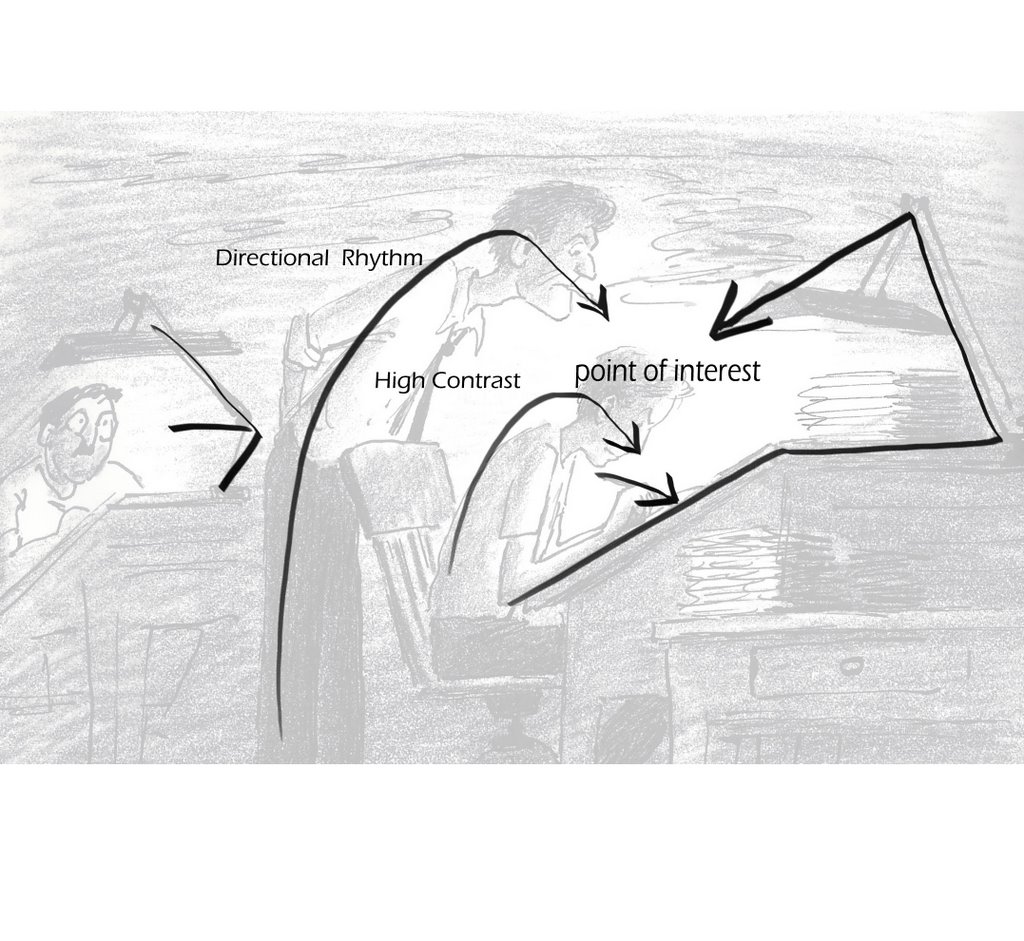
I sketched out the examples for this with one of my students and the T-shirt analogy came up. If you look at your shirt you'll see that the hole for your head comes out of the front, not the top where the shoulder seam is. Also, clothing has all the gesture lines we need to help guide us in the line work. Use the collar, use the seams, use whatever it is on that clothing to reveal the form. It's all overlap, and it is needed, unless you really want a flat looking drawing. Even those who draw in a so-called "flat" design style make use of these principles. Shane and Shannon, for instance, use overlap beautifully to show the forms working together, as well as staying completely away from tangents! They're super good!

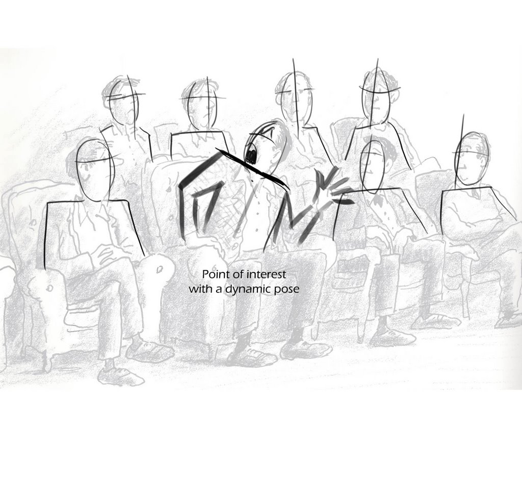
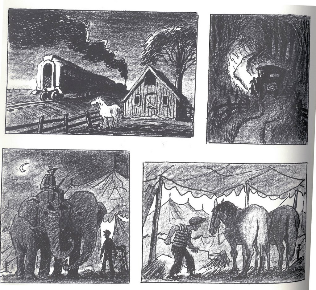
Down below I threw in a couple of drawings I liked, just for fun.

Hope all's well......


Friday, April 27, 2007

This girl is fun to draw

Heather Hoxey is one fun person. She came to my CALARTS class to model for us a couple of weeks ago. She was a hit so I had to get her into my regular class at DW. Either way she really is spunky and fun. I had a blast drawing her.


Monday, April 02, 2007

Marissa Gomez strikes again!

Marissa is one of my favorite models. I only wish I had more time to draw her.


Tuesday, March 13, 2007

Thoughts on drawing for storyboards-PT 4

Make those pupils read!

I've been seeing a lot of portfolios in the past few weeks and one of the things that really stands out to me is the lack of prominent pupils in story boards.

Strong, definite and clear eye direction is extremely important when it comes to boards. It allow us to see the thinking behind the character. All too often I see boards with huge eye circumference and tiny pupils, and it's really hard to see into that character's thoughts. I understand that there are different character designs out there but, story boards should be "read from across the room" even in this digital age. We look at the eyes first- and that allows us to see into that characters soul, his/her internal struggle. If I can impart anything to anyone who is putting together a portfolio or working on story boards at all...

Darken those pupils! Make them read!

Thursday, February 22, 2007

Tuesday, January 23, 2007

Three of Many

I say three of many because there are a lot of duds that don't make the cut. If anyone out there is building a portfolio the best way to do it is to work hard and Draw! Draw! Draw!

This is the motto of my class!

Rather than drawing specifically for a portfolio and have no discerning choices at hand. One should draw becuase they love it and pick the best drawings from that stack.

Give yourself choices.


Friday, January 12, 2007

Thoughts on drawing for storyboards-PT 3

"Negative space and overlapping shapes"

In all my days as an animator, story guy, and just plain sketch artist I've always had trouble with trying to get a pose right and make it "read from across the room".
I kept trying and trying and one day back in the Disney days, my good friend Tom Gately{Now an animator at a certain studio in emeryville- shamelss "freindship dues" plug} told me the most obvious of reasons why my drawings weren't reading.

"Your sillouette value is off"

Darn it! He was right and I couldn't get it out of my head. Now I know that's animation 101 but the easiest thing to understand isn't always the easiest thing to execute. For example I understand that an Archer needs to hit the bullseye from a far distance but I probably can't hit that bullseye for beans unless I work at it for some time and keep trying.

So ever since then I've been haunted by Tom's words in my head. Every drawing I've worked on to this day feels like it has his eyes of concern watching over saying "Your sillouette value is off".

All this time I tried to understand and break it down to the simplest form and the two principles out of the many that stuck out, where Negative space and Overlapping shapes.

When these two ideas are grasped and put into action your sillouette values will start to pop off the page. If your sketch or production drawing isn't working you might want to check and see if the drawing is breathing; is there enough air around and within the pose to see every part of it's acting or reason for being?

When overlapping shapes are concerned I always tell the students in my class to use the items on the model to show shapes in front of other shapes. Use the waist line to show the forms and directions of the body, the neck line and collars and even existing wrinkles in th clothing to help show that the knee is in front of the thigh. Props like wrist watches or helmets or anything the person is holding can also help when it comes to overlap.

Anyhow I think you get the picture. I still have to think about it when I draw and I'm glad Tom told me the truth when he did. I just wish his voice would get out of my head.

To help illustrate the point I drew over this wonderful page of Mickey's drawn by the master of sillouette Fred Moore. What's amazing about it was how clear and precise every drawing is and yet very very loose. I found this page on the great Disney History blog by Didier Ghez.

Enjoy.


Tuesday, January 09, 2007

It's all chill!

For what it matters, I'll be puttin' some stuff up soon!

Peace and Happy New Year People!

Thursday, December 14, 2006

More Class work

Sometimes it's too good not to draw. Our Model "Christine Havard" was excellent in the last session and I couldn't help but draw her. Thanks Christine!


Thursday, December 07, 2006

OSK!

I finally went out to see Jenny Lerew's Icelandic horses and I got a chance to sketch this one named "Osk". It was fun!


Monday, December 04, 2006

Gravity

It's what keeps us on the earth, otherwise we'd all be floating out into space. With out it we wouldn't be able to drive our cars or fly our planes. As we know the wieght of a car presses down on the road and the enertia of the vehicle pushes forward and voula! You're on you way to work. Our blood pressure and body structure is also dependent on it. Studies have shown that Astronuaghts that stay up in space for too long begin to atrophy and weaken as well as loosing bone density. We need gravity to survive.

And of course the other thing that shouldn't survive with out gravity is our drawings and art.

Too often the sketches of the models I see don't feel seated or balanced into their seats. The artist may also leave out important props like a chair and we then get floating people seated on thin air. A gesture sketch of someone sitting or opening a car door or anything involving a prop must have that prop drawn in. The prop is usually just as important as the character becuase it will help define what they are doing or thinking.

As gravity pulls on our bodies we don’t always stand straight up and down, I think we’d get tired and settle as we often do. We have a collapsible sort of break down to our postures. The soft malleable parts squash and bend and causes the opposite side to stretch until our hard bones and tougher cartilage rests upon itself and settles us into some form of comfort.

Understanding these kinesthetic ideas will also bring "Curves and Straights" into your work. Let their be straight lines in your drawings where it's needed. Allow for gravity to push up against your work and squash it to allow the form to have the weight it needs. If the person is sitting be cautious of how the rump flattens on the seat. Watch as peoples elbow to fore arm flattens on a table in the cafes. Watch the balance of the pose as you are laying down those first defining lines or your sketch.

Now here I give you {part one} of a bunch of pieces by a very talented friend of mine who is a staple in my gesture class Mr. Ken Morrissey. Ken has been an animator turned story artist and now animator again. His work executes many years of study and gravity definately plays it's part in his work. Ken is a very methodical artist with a keane sense for appeal and I always look forward to more of his work in class.

So please enjoy these pieces and as I always say, “have fun!”


Monday, November 27, 2006

Thoughts on drawing for storyboards-PT 2

So once again, now that I don't have any blogger issues I wanted to dish out part 2 of my tips on drawing for story. These pages were given to the Cal Arts kids a while back and I hope that this can inspire others as well.

the principles that weren't highlighted with visual aid in the last post were;

Line Density
Perspective and overlap
and Leaning the pose

I'm not going to go into heavy detail on these subjects, so I hope these pages are treated more like cheat sheets to remind us of the principles.

The "letter" panels on the left, really helped me understand this idea.

Leaning in the pose was something that Walt Stanchfield always knocked into my head. Certainly the straight poses in my examples have a place in this world but an ever so slight lean or a large lean, in any drawing helps give movement and wieght. Bill Peet does this constantly.


Once again, the perspective panels I drew were really more of a cheat sheet idea to remind us to overlap within perspective. Otherwise the drawings can be flat such as in the example third panel down on the right.

And last a few quick examples of high constrast and rhythm


Monday, November 20, 2006

Thoughts on drawing for storyboards-PT 1

I recently took some of the great illustrations from Bill Peet's autobio book and decided to draw over them and find out why I liked them so much. Aside from his artistic charm and wonderful acting and posing choices, there where things about his work that I thought supported what we do in the gesture class. We always look at these and grasp a bit of inspiration from them but then we keep on moving without considering how we can disect them. I know there are many ways of looking at art but for me this is how I looked at it and learned from it.

The terms that came to mind for me where:

Directional Rhythm- Using the lines and composition of the drawing to direct the eye to the point of interest.

High contrast- the point of highest contrast usually helps define the point of interest or the character you want the viewer to see.

Other terms {that will be on the next post, blogger issues} that I didn't write on these overlays, but it is evident in them, where;

Lean- do it when ever possible, even in the slightest way. only draw striaght up and down if the character calls for it. the more straight up and down the drawings, the less life it could have, so if your character is scared stiff maybe straight up and down is what you need. But lean when ever possible.

Perspective and overlap- We've all studied perspective and any book out there on the subject is usually fairly good to explain it but Overlap it extremely important to execute perspective Be it a flower pot, a car, a person or a building you need visual cues of diminishing sizes and shapes relating to each other to really get the effect working.

line density- the best way to understand this one is, if the object is further away, the lines should be thinner. If the object is close the lines should be thicker.

Tone and Value- Again, simply put, the closer to screen the darker it gets.


Life drawing and gesture drawing do translate to story sketching if we know how to bridge the gap. Hopefully these pics will help.